1. Rooms that borrow space from each other.

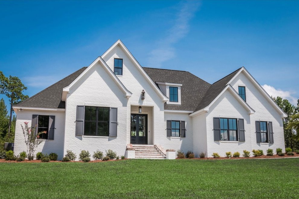
The classic example, which you find over and over again in a house plans search, is a great room plan with a kitchen and family room that occupy one big space. But even if the great room adjoins a closed room, like a home office, it could be separated by a sliding door – barn doors are all the rage, like in plan 437-83 above – that could be left open when no one’s home. You close it when the family comes home if you still need to work. Another common technique to create separation but promote openness is to leave a half wall between, say, a dining area and the great room. You could also separate a parlor with interior French doors, so that practicing musicians aren’t completely isolated.
2. Blurred boundaries between indoor and outdoor space.

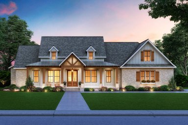
These days, you see a lot of plans with sliding glass doors that separate the great room from a patio or outdoor room. Some fold back accordion style, or pocket into the wall, to make the outdoors read like indoor space. That’s a great in a luxury home, especially when floor and ceiling treatments extend from indoor to outdoor space, cementing the impression of one living area. A less expensive approach, though, may be to use a 16-foot sliding unit, with two inside doors that slide over two outer doors, providing an 8-foot opening in 16 feet of glass. “It’s considerably less expensive than a multi-slide or multi-fold door unit,” says architect Janet Hobbs, designer of splendid plan 935-14 above.
3. Inexpensive drywall details.
Wood beams certainly draw attention to the ceiling of a great room or living room. But you can often create equally interesting and less expensive ceiling motifs with drywall, especially when highlighted by lighting. Another money-saving technique is to create a simple, enclosed pantry with sheetrock instead of cabinetry behind a conventional interior door. In fact, inexpensive sheetrock details can be used throughout the house – on the staircase, in the kitchen – to create a design motif for your home.
4. Trim space by reducing dedicated hallway space.

The best designs anticipate how people move from one room to another. They minimize square footage dedicated to pure circulation in favor of connected living space. The result: bigger rooms. Plan 929-885 above trims almost all hallway space away.

When hall space can’t be avoided, a good approach is to use it for more than one purpose; maybe there’s room for a homework den like the one in plan 48-693 above. Widening upstairs hallways by only one foot often provides enough depth for built-in bookshelves.
5. Windows that frame outdoor views.

Strategically located windows draw the eye to exterior views, making homes appear larger and more inviting. The optimal situation is when windows frame views of landscaping, especially if that’s the view upon entering a house or key public room. Windows on two sides of a room allow a house to “breathe” by creating natural airflow. That’s easier to achieve when a house is only one room wide. When light enters a room from two directions, it cuts down on glare. A reflective surface near a window – something as simple as a sill or a table – will bounce natural light into a room, reducing the need for electric lighting. Plan 888-16 above features a wide but shallow footprint and large windows in the master suite.
6. A potential first-floor master suite.
You may be fine climbing stairs to a second-floor master bedroom today, but what about 15 years from now? When your hips or knees go, you may appreciate having a potential first-floor bedroom that’s adjacent to the powder, especially if you can easily rearrange interior walls to draw the bathroom into a master suite. Some plans anticipate this contingency by placing a closet or utility space next to the powder that could one day house a shower.
7. Space for a pocket office.

Many homeowners these days find that creating an alcove for a pocket office is a more effective use of space than having a dedicated home office. Maybe all you need is a small recess with a desk to pay the bills and take notes while making an occasional phone call. The beauty of having a strong wireless system is that you can work anywhere you want in the home, maybe even outdoors. You may still want a dedicated home office if you are on the phone all day, attend teleconferences, or see clients. Plan 48-646 provides a small office near the front of the home, with a powder bath nearby.
8. Bathtubs instead of stall showers in some secondary baths.
The beauty of old-fashioned bathtubs is that they take up less space. Most are 30-inches wide instead of the minimum 42 inches needed for a decent stall shower. They also cost less, since a shower requires a pan, extra tile work, shower glass, and extra labor to assemble. You may still want to have at least one other stall shower (beside the one in the master) for the person who doesn’t want to or can’t step into a tub. New tract homes now commonly feature pedestal bathtubs that take up even less space and provide a focal point.
9. Floating cabinets in the bath.

These provide a longer uninterrupted view of the floor, making the space feel larger, like this bathroom in plan 430-169. They also make it easier to replace flooring material if you want to update the room. You may even save a little money on cabinets that don’t run all way down to the floor. You could use the savings for under-cabinet lighting that provides a light at night.
10. A second-floor laundry.

Stay-at-home parents may appreciate having the laundry near the kitchen, so they can multi-task. But dual-income families on the go may prefer to have the laundry on the second floor, close to the master bath, where dirty clothes are discarded and clean ones put away. “This saves steps when you realize that shirt you meant to wear is still in the dryer,” says Hobbs. Stacking washers and dryers mean you could even put the laundry in a hall closet, though that arrangement may not leave much space for folding clothes. Plan 938-89 features a laundry closet upstairs, just steps away from the master suite and two secondary suites. A larger laundry room sits downstairs for the use of the other master suite (ideal for an in-law or elderly guests).
Browse affordable house plans to find your budget-friendly layout.


